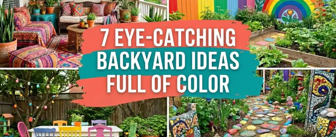
Colorful backyard ideas require a different design discipline than neutral or naturalistic outdoor spaces. Color creates energy, joy, and the kind of immediate visual reaction that makes a garden memorable. But color without intention creates visual chaos — a backyard where everything competes and nothing leads. These 7 ideas each show how to use color deliberately: how to anchor it, how to layer it, and how to create the eye-catching result that makes people stop and look.
Each idea here addresses a specific color strategy — from a single painted fence accent wall that anchors a whole yard to a mosaic pathway that makes every step a visual event.
Table of Contents
1. A Bold Painted Fence Wall: The Color Anchor That Organizes the Whole Backyard
✦ Painted Fence Accent Wall
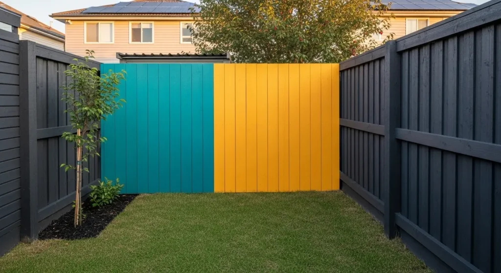
A painted fence accent wall uses one section of fence in a bold color as the organizing anchor for all other color in the backyard. Every other color element — cushions, pots, plants — relates back to the accent wall color. The result is a colorful backyard that looks coordinated rather than chaotic because all the color has a single reference point.
The accent wall principle: paint 80% of the fence in a dark neutral — charcoal, deep green, or slate — and one section in the bold color. The neutral surround makes the accent section appear bolder than it would against a white or light fence. The contrast of one bright section against dark surroundings creates the visual stop that neutral-painted fences never produce.
Color selection for fence accent walls: deep teal works with terracotta and rust plant colors. Vivid coral works with sage green and deep burgundy. Mustard yellow works with charcoal, navy, and deep purple planting. Choose the accent color by identifying the strongest color in your intended planting scheme and selecting an accent wall color that relates to it rather than competes with it.
PRO TIP: Apply the bold accent wall color to the fence section that sits directly behind the primary seating area. The accent wall then functions as both a visual focal point seen from across the yard and as an immediate backdrop for the seated experience — the most used position in the backyard has the most visual interest behind it.
2. A Color-Gradient Flower Bed That Reads Like a Rainbow From One End to the Other
✦ Rainbow Flower Bed Design
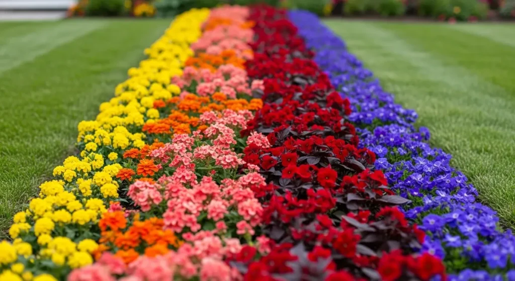
A color-gradient flower bed plants a border in a deliberate color progression — yellow transitioning through orange, coral, red, purple, and blue along the full border length. Seen from the end of the garden the border reads as a living color spectrum. Seen up close each section reveals its individual plant varieties. The gradient approach creates maximum color impact while maintaining the internal logic that prevents a multi-color planting from looking random.
The color sections should be at least 3 feet wide for each color family to read as a distinct zone at garden viewing distances. Narrower color sections lose their identity and the gradient effect becomes a spotted patchwork rather than a flowing transition. Within each color section use two to three varieties in that color family at different heights — the variation within the color section adds texture while maintaining the color discipline.
The transition between color sections is the technical challenge of gradient planting. Place bicolor flowers — varieties that contain elements of both adjacent colors in their petals — at each color boundary. A red-orange rudbeckia at the orange-red transition, a blue-purple salvia at the purple-blue transition, creates a seamless graduation rather than a hard line between colors.
3. A Mosaic Pathway That Makes Every Step Through the Backyard a Visual Event
✦ Mosaic Garden Pathway
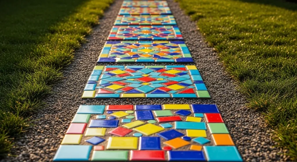
A mosaic garden pathway creates the most consistently eye-catching color feature in any backyard because it is interactive — people walk it, look down at each stone, and engage with the color at the specific moment of movement through the garden. Static color features are seen from a distance. A mosaic pathway is experienced underfoot.
The pathway design approach: create a series of individual mosaic stepping stones in a connected visual theme rather than completely random designs. A botanical theme with each stone showing a different flower. A geometric theme with each stone in a different color of the same geometric pattern. A word theme with each stone carrying one letter of a word or phrase that becomes legible as visitors walk the full path length.
The DASTOLL Stained Glass Sun Catcher broken carefully into geometric glass pieces provides the highest-impact mosaic material available — the glass pieces catch and refract light in a way ceramic tile cannot, creating a pathway that actively sparkles in afternoon sun rather than simply reflecting it. Find it linked on Amazon.
PRO TIP: Set mosaic stepping stones at spacing that feels slightly too close together — 12 inches between stones rather than the 16 to 18 inches that feels more natural. Closely spaced stepping stones slow the pace of walking along the path and increase the time spent looking at each stone. The slightly compressed spacing is the design detail that makes a mosaic pathway genuinely interactive rather than functional with decorative stones.
4. Color Block Patio Styling: Bold Color Applied in Deliberate Geometric Zones
✦ Color Block Patio Styling
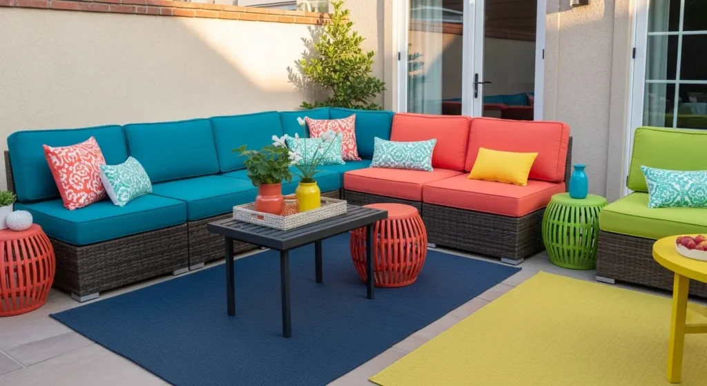
Color blocking applies the fashion design principle of bold solid color zones to outdoor space. Rather than distributing multiple colors evenly across a patio each color is concentrated in one defined area — a seating zone entirely in one color family, a dining area in another, a plant corner in a third. The result is a patio that reads as a designed color composition rather than a collection of colorful objects.
The color blocking technique for a patio: choose three bold colors and assign each to one distinct zone. Achieve the zone color through cushions, outdoor rug, planter colors, and the plants grown in those planters simultaneously. A teal zone uses teal cushions on the lounge seating, a teal outdoor rug beneath them, and blue-flowering plants in nearby containers. The color consistency across every element in the zone creates the block quality that makes the design readable from across the yard.
Color blocking works best with colors that have high contrast between zones. Teal beside coral beside yellow creates maximum visual energy. Teal beside navy beside grey creates insufficient contrast for the blocking effect to read clearly. The zone boundaries should be created by furniture arrangement rather than masking tape lines — a natural spatial gap between seating zones becomes the color boundary.
PRO TIP: Use the color blocking principle for seasonal refresh. Swap the zone colors between spring and summer by changing only cushion covers and pot colors — the outdoor rug and furniture frame stay constant. Coral and terracotta blocks in summer become ochre and rust in autumn. The zone structure stays. The color changes. Two distinct seasonal patio personalities from one layout.
5. A Bold Potted Plant Mix: Grouped by Color Theory, Not by Alphabetical Plant Name
✦ Bright Potted Plant Mix
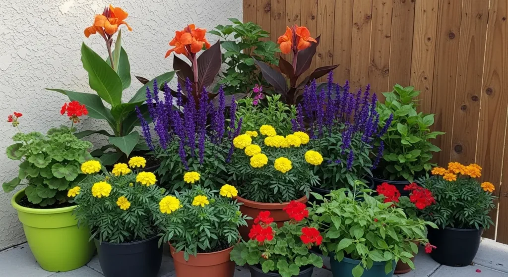
A bold potted plant mix organized by color theory rather than plant type creates significantly more visual energy than the same plants chosen for their individual qualities. Color theory provides two reliable pairing strategies for maximum visual impact: complementary colors — opposite on the color wheel — create the highest contrast and most vibrant combinations. Analogous colors — adjacent on the color wheel — create harmonious rich combinations with less contrast but more depth.
The complementary color pairs that produce the most eye-catching potted plant combinations: orange and blue-purple (orange Canna and purple Salvia). Red and green (scarlet Pelargonium and deep green Cordyline). Yellow and violet (yellow Marigold and deep violet Petunia). Each complementary pair creates the vibrating color contrast that makes both colors appear more vivid than either does alone.
The container color must support the plant color rather than compete with it. Bold plant colors in neutral containers — dark grey, charcoal, or terracotta — allows the plant color to dominate. Bold plant colors in bright containers create a competition between container and plant that reduces the impact of both. The Quarut Large Planter Pots in grey provide the correct neutral container backdrop for maximum flowering color impact. Find them linked on Amazon.
PRO TIP: Plant complementary color combinations in odd-numbered groups of the same species within the pot rather than one plant each of two complementary colors. Three orange Canna beside one pot of three purple Salvia creates more visual impact than one orange plant beside one purple plant because the color mass in each pot is sufficient to read from distance. Single plants of complementary colors cancel each other out at viewing distance.
6. A Colorful Vertical Wall Garden Uses Height to Make Color Visible Across the Whole Yard
✦ Vibrant Vertical Garden Wall
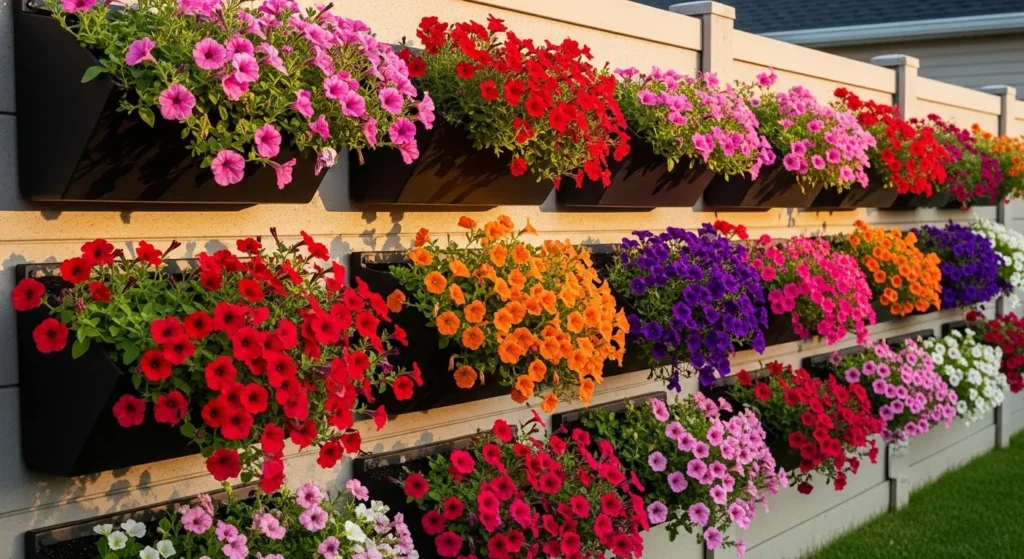
A colorful vertical wall garden uses height to make color visible across the full yard — the same flowers at ground level are only visible from nearby, but the same flowers at 5 feet height are visible from every position in the space simultaneously. Vertical color is the most spatially efficient color investment in any backyard because every dollar of plant material is visible from everywhere rather than only from close range.
The vertical color strategy that creates the most impact: use one color family in each row of wall planters rather than a random mix throughout. A row of red Pelargonium at the top. A row of orange Calibrachoa in the middle. A row of yellow trailing Bidens at the base. The horizontal color banding creates a planned color composition on the vertical surface that reads as designed from across the yard.
Maintenance for a colorful vertical wall garden requires consistent deadheading and feeding — flowers at height dry faster than ground-level containers and require more frequent watering. Install a drip irrigation line along the top mounting rail before adding any planters and run one drip emitter per container. The irrigation investment transforms a high-maintenance colorful vertical wall into an almost self-managing color display.
7. A Planned Seasonal Flower Explosion: Maximum Color for Maximum Impact at Specific Times
✦ Seasonal Flower Explosion
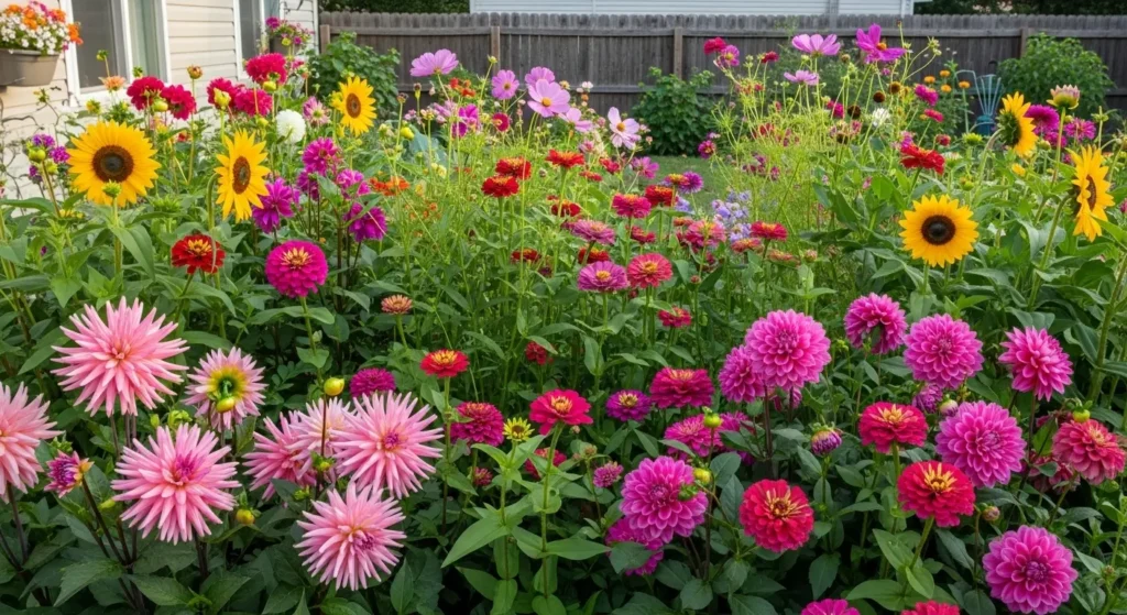
A planned seasonal flower explosion is the colorful backyard approach that produces the most dramatic result on specific dates — a party weekend, a summer gathering, or the weeks when visitors are expected — by timing plantings to peak simultaneously rather than distributing bloom time evenly through the season.
The timing approach: work backward from the target date. For a peak display in late July choose plants that reach peak flowering 10 to 12 weeks after planting — dahlias from tubers planted in May, zinnias from seed sown in May, sunflowers from seed sown in April. All three reach simultaneous peak in late July. Supplement with cosmos planted in June for the later-season airy filler that extends the display into September.
The explosive color effect requires density. Space plants at 60% of the recommended spacing to create the packed abundant display that individual-spaced plants never achieve. The initial overcrowded look resolves itself within 4 weeks as plants grow into each other — by peak flowering the dense planting creates the flower explosion effect where individual plants are indistinguishable within the mass of color.
The VOOKRY Solar Watering Can Light positioned within the flower explosion border adds the magical evening focal element that extends the colorful backyard experience after dark — the fairy light pouring effect catches among the flower stems at dusk creating a completely different and equally beautiful display as the sun sets. Find it linked on Amazon.
PRO TIP: Keep a planting diary recording exactly which varieties were planted when and what the peak date was. A seasonal flower explosion that worked perfectly in Year 1 is reproducible every subsequent year from the diary record — the timing knowledge accumulated from one season eliminates the guesswork from all subsequent ones.
The Color Discipline That Makes Bold Backyards Work
Every colorful backyard that looks intentional rather than chaotic follows the same underlying discipline: one dominant color, one secondary color, and one accent. The 60-30-10 rule applies as much to bold backyard color as it does to any design context.
60% of the yard in one dominant color — usually the fence, large furniture pieces, and the majority of planting. 30% in a secondary color that relates to the dominant without matching it. 10% in a bold accent that creates the focal point. The accent is the eye-catcher. The dominant and secondary are its supporting context.
Backyards that use five equally weighted colors have no focal point because every color competes. The 60-30-10 structure creates hierarchy — the viewer’s eye knows where to go first, second, and third. That directed visual journey is what makes a colorful backyard feel designed rather than decorated.
📌 More backyard and garden ideas → 25 Stunning Back Porch Patio Ideas
Frequently Asked Questions
How do I add color to my backyard?
The most effective ways to add bold color to a backyard are in order of impact: a painted fence accent wall in one bold color that anchors the whole yard’s color scheme, dense container planting using complementary color theory pairs for maximum vibrancy, and a mosaic pathway that creates interactive color at ground level. According to the American Horticultural Society the highest-impact single color addition to any outdoor space is a painted vertical surface — fences and walls carry color at the height and scale that plants cannot match for immediate visual effect.
What colors look best in a backyard?
The colors that create the most consistently eye-catching backyard results are bold saturated tones with clear relationships to each other. Complementary pairs — orange and blue-purple, red and green, yellow and violet — create maximum vibrancy. Analogous combinations — coral, orange, and yellow or blue, teal, and green — create rich harmonious results with less visual tension. Avoid mixing warm and cool colors at equal saturation — the visual vibration between warm red and cool blue at the same intensity creates discomfort rather than energy. Let one temperature family dominate.
How do I make my backyard more colorful on a budget?
The most budget-effective colorful backyard upgrades are: painting one fence section in a bold color at $10 to $20 in exterior paint. Replacing outdoor cushion covers in a bold color scheme at $15 to $25 for a complete seating refresh. Sowing zinnia or cosmos seeds directly in borders at $3 to $5 per pack for summer-long abundant color. Adding one bold-colored large container with vivid flowering plants at $15 to $25. These four changes together cost under $75 and produce a backyard color transformation visible from the street.
A Colorful Backyard Is a Decision, Not an Accident
The backyards that catch every eye and stop every scroll share one quality: someone decided to use color boldly rather than safely. They chose the vivid fence accent instead of the neutral grey. They planted the complementary color pair instead of the safe harmonious blend. They built the mosaic pathway instead of the plain gravel one.
Choose one bold color decision from this guide and commit to it fully. A half-committed bold color choice is worse than no color choice at all. The eye-catching backyard belongs to whoever was willing to go all the way.
All the products mentioned in this article are linked on Amazon. Every recommendation is something we genuinely believe in.
More Backyard and Garden Ideas
→ 12 Boho Garden Ideas You’ll Love
→ 14 Relaxing Tropical Patio Ideas For Summer
→ 25 Chic Outdoor Living Patio Ideas You’ll Want To Copy
→ 10 Garden Art Ideas That Instantly Upgrade Your Yard
The eye-catching backyard belongs to whoever was willing to go all the way with color. Choose one bold decision and commit to it fully.