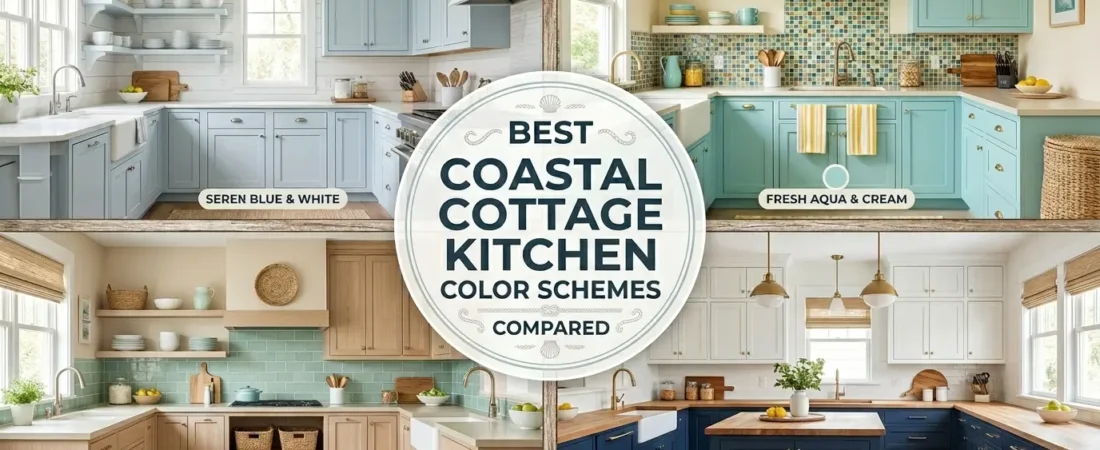
Choosing the right color scheme is the single most impactful design decision in any kitchen — and in a coastal cottage kitchen it is especially consequential because the wrong color combination can tip the room from charming into cold, from relaxed into clinical, or from coastal into nautical themed. The best coastal cottage kitchen color schemes share one quality: they make the kitchen feel like it has always been there, bathed in the specific warm-cool light of a building near water.
This guide compares eight of the most proven coastal cottage kitchen color schemes — analyzing what makes each one work, which kitchen types and natural light conditions each suits best, and the specific paint, cabinet, and accent combinations that produce the best results for each scheme.
Table of Contents
What Makes a Coastal Cottage Kitchen Color Scheme Actually Work
Three factors determine whether a coastal cottage kitchen color scheme looks genuinely coastal or merely blue-and-white: the warmth of the white tones used, the quantity discipline applied to accent colors, and the material relationship between colors and surfaces.
Warm whites over cool whites:
Cool bright whites create a clinical quality that contradicts the cottage warmth. Warm whites with greige, cream, or yellow undertones create the specific light-filled warmth of a coastal building interior. This distinction alone separates most successful coastal cottage kitchens from unsuccessful ones.
Accent color quantity:
The coastal palette requires accent colors to be used at 10 to 20% of the total color area. More than this and the kitchen tips from coastal into nautical or heavily themed. The 80/20 principle applies directly — 80% neutral warm base, 20% coastal accent color.
Material relationship:
Color looks different on different materials. Sage green on linen cushions reads differently from sage green on painted cabinets. The same color scheme applied to different material combinations produces different atmospheres — a color scheme must be evaluated in the context of the specific materials it will be applied to.
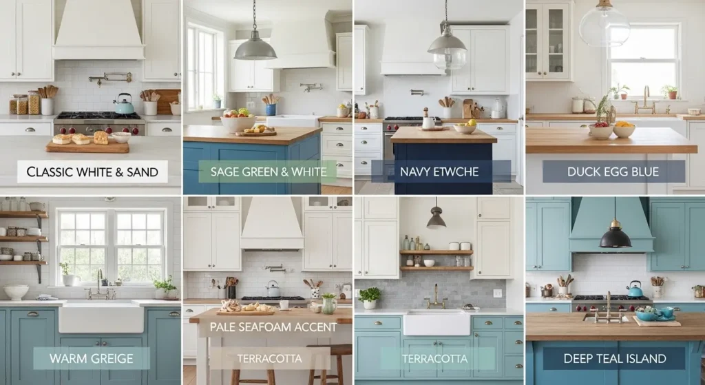
Classic White and Warm Sand
★★★★★ Best for: maximum light reflection and universal appeal
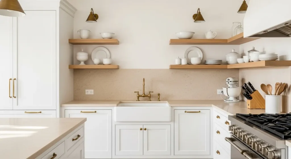
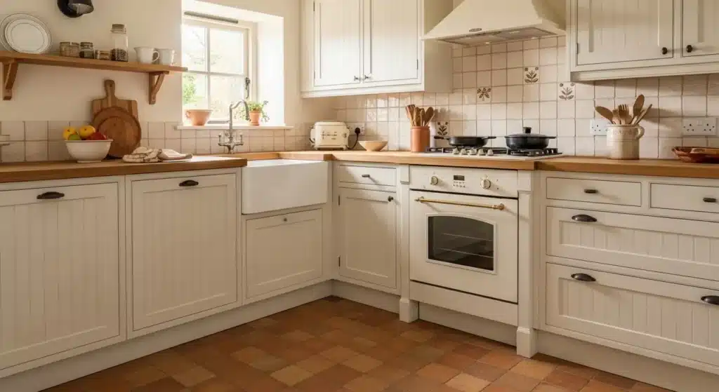
The classic white and warm sand scheme is the foundation from which every other coastal cottage kitchen color combination derives. It is the most forgiving, the most universally appealing, and the easiest to execute because both colors are neutral and everything added to them improves rather than competes.
The white in this scheme must be warm white — not brilliant white. Benjamin Moore White Dove (OC-17) is the most specified warm white for coastal cottage kitchens because its subtle warm undertone prevents the clinical quality of pure white while maintaining full light reflectivity. Sherwin-Williams Alabaster (SW 7008) is the closest alternative.
The sand tone comes entirely from natural materials — limestone or travertine countertops, natural timber shelving, jute rugs, and linen textiles — rather than from paint. Paint in any beige or sand tone on walls or cabinets creates a dated quality that natural material sand tones do not.
Best for: North-facing kitchens with limited natural light where maximum light reflection is the priority. Small kitchens where visual expansion is needed. Kitchens in any home style from traditional cottage to contemporary coastal.
PRO TIP: Add warmth to an all-white coastal cottage kitchen through hardware rather than paint. Brushed brass or aged brass cabinet hardware adds the warm material tone that prevents white kitchens from feeling cold without adding a second paint color to manage.
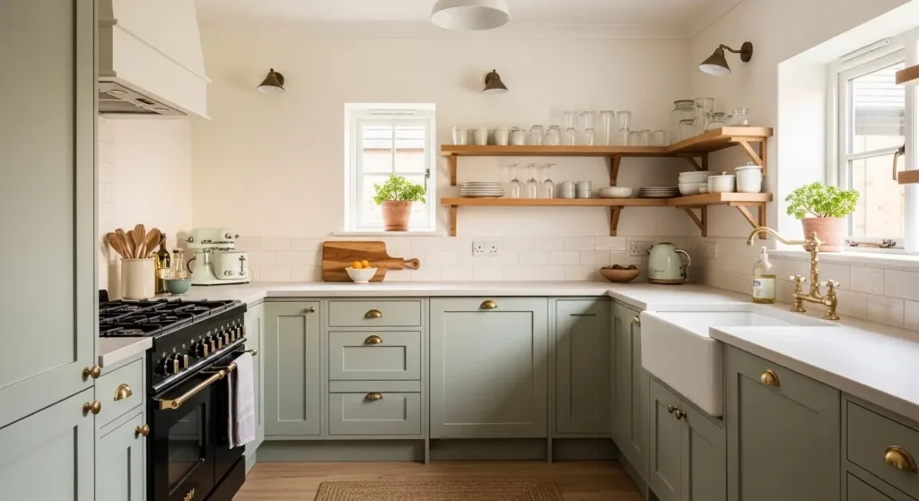
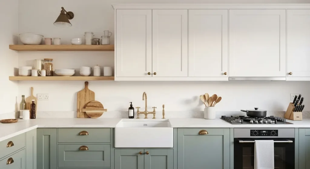
Sage Green Lower Cabinets and White Uppers
★★★★★ Best for: contemporary cottage character with maximum versatility
The sage green lower cabinet scheme is the most popular and most saved coastal cottage kitchen color combination on Pinterest for 2025 and 2026 because it achieves the most difficult balance in kitchen color design — adding genuine color character while maintaining the light airy quality that coastal kitchens require.
The sage green must be muted and grey-toned rather than vivid. The colors that produce the best coastal cottage kitchen results: Farrow and Ball Mizzle (No.266), Sherwin-Williams Softened Green (SW 6176), and Benjamin Moore Pale Avocado (HC-130). All three are grey-toned sage greens that read as sophisticated rather than vibrant.
The two-tone treatment places sage green on lower cabinets only — above the countertop line everything is white. This quantity discipline keeps the color below the visual horizon and prevents the kitchen from feeling colored rather than accented.
Best for: South and west-facing kitchens with good natural light where the sage green color is activated by warm afternoon sun. Kitchens where the homeowner wants character beyond a purely white palette. Any size kitchen.
PRO TIP: Paint the kitchen island in the same sage green as the lower cabinets rather than matching the upper white cabinets. An island in the accent color creates a deliberate color focal point at the kitchen center and reinforces the two-tone color story without adding any additional colors.
Soft Navy Lower Cabinets and Crisp White Uppers
★★★★☆ Best for: strong coastal character with a traditional cottage feel
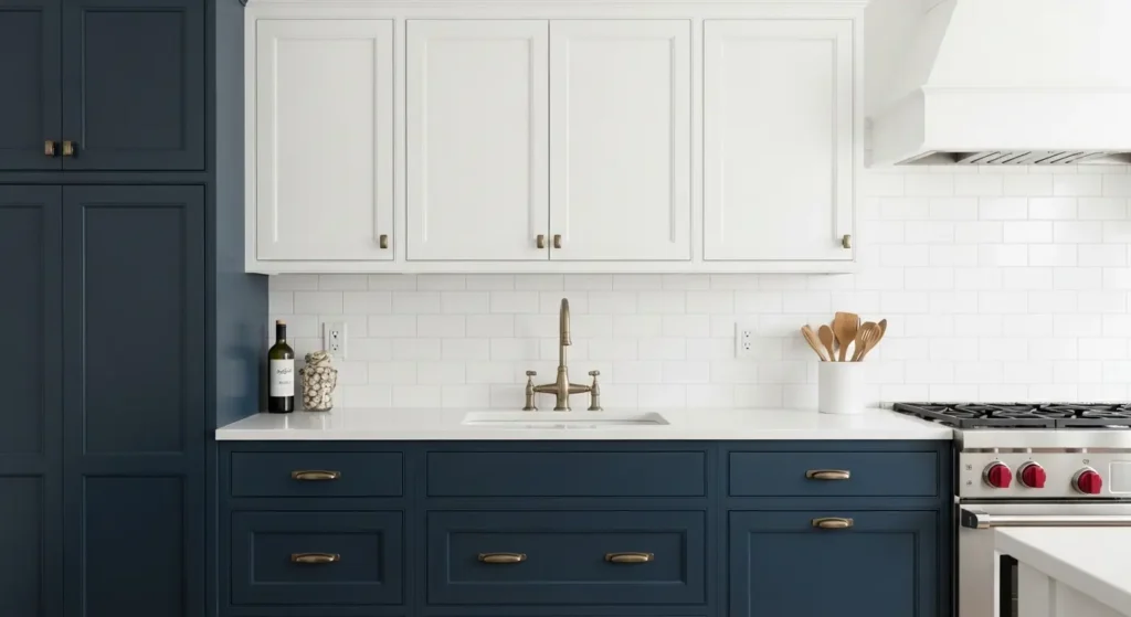
The soft navy and white scheme creates the strongest and most unmistakably coastal cottage kitchen color statement of all the options in this guide. Navy directly references the deep ocean and produces the high-contrast drama that makes coastal kitchens instantly recognizable.
The critical specification is the quality of the navy — it must be soft and warm-toned rather than harsh or cold. Harsh navy reads as corporate. Soft warm navy reads as coastal. The best coastal cottage kitchen navy paints: Farrow and Ball Hague Blue (No.30), Benjamin Moore Hale Navy (HC-154), and Sherwin-Williams Naval (SW 6244). All three are warm-undertone navies that produce a sophisticated coastal result rather than a corporate one.
The quantity discipline for navy is stricter than for sage green — navy is a stronger color that dominates more easily. Lower cabinets only, never walls. All upper cabinets in white. White subway tile backsplash to reflect light back into the space and prevent the navy from absorbing all available light in the kitchen.
Best for: Large kitchens with generous natural light where the navy can be balanced by sufficient white and light. Traditional cottage styles where the bold color suits the architectural character. Kitchens where the homeowner specifically wants a strong coastal color statement.
Duck Egg Blue Throughout With White Accents
★★★★☆ Best for: soft all-over coastal color in traditional and vintage cottage kitchens
Duck egg blue applied to all cabinets — both upper and lower — creates the most distinctive and most unmistakably cottage-quality coastal kitchen color scheme. Where the two-tone schemes use color as accent, the all-over duck egg blue scheme uses color as the primary design statement with white as the accent.
Duck egg blue sits at the intersection of blue, green, and grey — a complex tonal quality that changes character dramatically under different light conditions. In morning light it reads as predominantly blue-grey. In afternoon light it reads as predominantly blue-green. This shifting quality is the specific charm of duck egg that flat blues and flat greens cannot replicate.
The best duck egg blue paints for cottage kitchens: Farrow and Ball Blue Ground (No.210), Little Greene Aquamarine (174), and Crown Duck Egg. All three have the complex warm undertone that prevents duck egg from reading as cold turquoise.
Best for: Traditional and vintage cottage kitchens where an all-over color treatment suits the architectural character better than a two-tone approach. Kitchens with good natural light from south or east-facing windows. Smaller kitchens where the all-over color creates a cocooning quality rather than a overwhelming one.
PRO TIP: Use white grout with any tile backsplash in a duck egg blue kitchen. Colored or contrasting grout creates visual busyness that competes with the all-over cabinet color. White grout tiles read as a unified white surface that provides clean contrast to the duck egg cabinetry.
Warm Greige With Driftwood Timber Accents
★★★★☆ Best for: sophisticated neutral coastal with maximum warmth
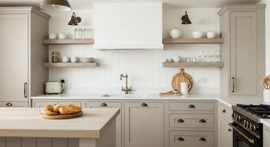
The warm greige and driftwood scheme is the most sophisticated neutral coastal cottage kitchen color combination — it creates a coastal atmosphere entirely through material warmth and tonal quality rather than through any distinctly coastal color accent.
Greige — the mid-point between grey and beige — reads as more current and more sophisticated than either pure grey or pure beige. In a coastal cottage kitchen warm greige on cabinets paired with bleached or driftwood-finish timber creates the specific material warmth of weathered coastal buildings without requiring any blue, green, or navy accent colors.
The best greige cabinet paints for coastal cottage kitchens: Farrow and Ball Elephant’s Breath (No.229), Benjamin Moore Pale Oak (OC-20), and Sherwin-Williams Accessible Beige (SW 7036). All three are warm-undertone greiges that read as coastal in context without reading as obviously grey or obviously beige.
Best for: Contemporary cottage styles where the owner wants a neutral palette with character. Kitchens where strong accent colors feel too bold. Open-plan kitchens where the kitchen must harmonize with adjacent living areas.
PRO TIP: Add one coastal accent color through accessories only in a greige coastal kitchen — one blue-grey ceramic vessel, one sage green plant pot, or one rattan pendant light shade. The greige base allows any accent color to be changed seasonally without repainting.
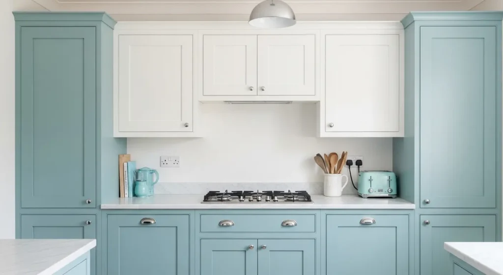
Pale Seafoam Green and Warm White
★★★★☆ Best for: fresh feminine coastal cottage character
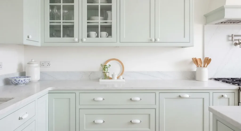
Pale seafoam green is the most delicate and most feminine of all coastal cottage kitchen color schemes — a green so muted it reads almost as white in low light and reveals its blue-green character only in direct sunlight. This subtlety is its specific charm: the kitchen changes character through the day in a way that a single-note color scheme cannot.
Seafoam green sits between sage green and duck egg blue in the coastal color family — greener than duck egg and lighter than sage. The best seafoam kitchen cabinet paints: Farrow and Ball Mist (No.CS6), Benjamin Moore Sea Salt (OC-26), and Sherwin-Williams Sea Salt (SW 6204). Note that Sherwin-Williams Sea Salt is one of the most popular kitchen colors in the US for this reason — its pale aqua-green reads as both coastal and cottage simultaneously.
The warmth specification matters as much as the color for seafoam. Cool-toned seafoam greens read as clinical bathroom tiles rather than warm cottage kitchens. Warm-undertone seafoam greens with a slight cream or yellow base tone create the genuine cottage warmth this scheme requires.
Best for: Kitchens with abundant natural light where the subtle color is activated rather than lost. Cottages and beach houses where the fresh delicate color suits the architectural lightness of the building. Bedrooms converted to studio kitchen use where a gentle color suits the multi-purpose space.
Chalky Off-White With Terracotta Accents
★★★☆☆ Best for: Mediterranean and southern coastal cottage styles
The chalky off-white and terracotta scheme references the Mediterranean coastal tradition rather than the Atlantic or Pacific coastal aesthetic — it is the color language of Greek island kitchens, Portuguese farmhouses, and southern European coastal cottages rather than New England beach houses or British seaside cottages.
Off-white cabinet paint with warm yellow or pink undertone — Benjamin Moore Linen White (OC-146), Farrow and Ball Lime White (No.1), or Sherwin-Williams Antique White (SW 6119) — provides the chalky warm white base. Terracotta appears in tile flooring, backsplash tiles, and ceramic accessories rather than in cabinet paint.
This scheme works because terracotta is the natural mineral color of the Mediterranean coastline — the clay soil, the roof tiles, the pottery — rather than an arbitrary accent color. Its presence in a coastal cottage kitchen creates authentic regional character.
Best for: Kitchens in warm sunny climates where the terracotta color is activated by strong sunlight. Mediterranean-style homes where the color language references southern European architecture. Kitchens where the homeowner wants warmth rather than the cooler freshness of blue-based coastal schemes.
PRO TIP: Use matte or chalky paint finishes throughout a terracotta-accented coastal kitchen rather than satin or gloss. Matte finishes absorb and diffuse light in a way that creates the specific warm quality of limewashed Mediterranean walls. Satin and gloss finishes reflect light in a way that makes the terracotta accent tiles look garish rather than warm.
Deep Teal Island With White Perimeter
★★★★★ Best for: maximum impact with minimum commitment to color
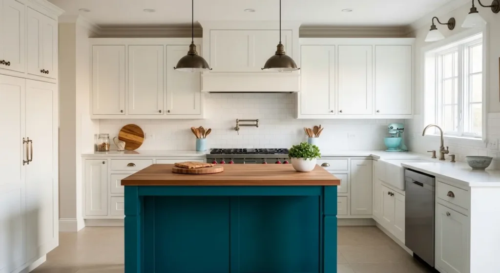
The deep teal island scheme applies the maximum-impact minimum-commitment principle to coastal cottage kitchen color — the entire perimeter stays white and all the coastal color commitment is concentrated on the single island surface where it creates the most impact and can be repainted most easily if preferences change.
Deep teal is the most sophisticated coastal accent color available — richer than navy, more complex than sage green, and more current than duck egg blue. It references the specific deep-water coastal teal that is visible in clear water photographs of tropical and Mediterranean coasts.
The best deep teal island paint colors: Farrow and Ball Vardo (No.288), Benjamin Moore Dark Teal (2054-20), and Sherwin-Williams Reflecting Pool (SW 7171). All three are rich warm-toned teals that create an island focal point of genuine presence without the heaviness of black or the corporate quality of some navies.
A butcher block countertop on the teal island creates the highest contrast and most beautiful material combination — warm natural timber on deep teal is the pairing that most consistently photographs well and produces the greatest satisfaction among homeowners who have made it.
Best for: Any size coastal cottage kitchen with an island. Homeowners who want strong coastal color character but are hesitant to commit to colored perimeter cabinets. Open-plan kitchens where the island needs to function as a visual anchor for the whole space.
PRO TIP: Paint the inside of the island cabinet shelves and drawers in the same deep teal as the exterior. When the drawers are open and the cabinet doors swing out the interior color creates a moment of design detail that makes the kitchen feel considered throughout rather than only on its exterior surfaces.
Quick Comparison: Which Scheme Is Right for Your Kitchen?
If your kitchen has limited natural light:
Classic White and Warm Sand. Maximum light reflection. Avoid duck egg blue all-over and deep teal which absorb light in north-facing positions.
If you want strong coastal character without repainting everything:
Deep Teal Island With White Perimeter. Maximum color impact from one island repaint.
If you want the most universally popular current scheme:
Sage Green Lower Cabinets and White Uppers. The most saved coastal kitchen combination on Pinterest for two consecutive years.
If your kitchen is small:
Classic White and Warm Sand or Pale Seafoam Green. Both maximize the perception of space. Avoid all-over duck egg blue in very small kitchens.
If your cottage style is traditional rather than contemporary:
Duck Egg Blue Throughout or Chalky Off-White With Terracotta. Both suit traditional cottage architecture better than the cleaner contemporary schemes.
📌 More coastal home decor ideas: How To Design a Small Coastal Kitchen
Frequently Asked Questions
What are the best colors for a coastal cottage kitchen?
The best coastal cottage kitchen color schemes use warm white as the dominant base with one carefully chosen accent color applied at 10 to 20% of the total color area. The most popular and most proven combinations are sage green lower cabinets with white uppers, soft navy lower cabinets with white uppers, and deep teal island with white perimeter. According to Houzz the sage green and white two-tone kitchen is the most specified coastal cottage kitchen color combination for 2025 and 2026, with Sherwin-Williams Sea Salt and Farrow and Ball Mizzle as the two most commonly specified sage green paints.
Should coastal cottage kitchen cabinets be white or colored?
The most successful coastal cottage kitchens use white on upper cabinets in every case — whether the lower cabinets are white, colored, or a natural timber. White upper cabinets maintain the light-reflective quality that the coastal aesthetic requires above the countertop line. Colored upper cabinets in any coastal kitchen scheme tend to make the kitchen feel heavy and dark rather than light and airy. The safest and most proven approach for maximum coastal kitchen success: always white uppers, optional color on lower cabinets only.
What hardware suits a coastal cottage kitchen?
Brushed brass or aged brass hardware is the most consistently recommended coastal cottage kitchen hardware finish because its warm metallic tone creates the material warmth that the coastal palette needs without the cold quality of chrome or the industrial quality of matte black. Brushed brass suits white, sage green, and greige cabinet schemes. Matte black hardware suits deep teal and navy cabinet schemes where the dark cabinet color requires a contrasting hardware tone. Chrome and polished nickel suit duck egg blue and pale seafoam schemes where the cool metallic reinforces the cool-warm balance of the color.
What countertop goes with a coastal cottage kitchen color scheme?
White marble or marble-effect quartz countertops suit white, sage green, navy, duck egg blue, and seafoam coastal cottage kitchen color schemes — the white surface maintains light reflection and provides clean contrast to colored cabinets. Butcher block timber countertops suit greige, terracotta accent, and deep teal island schemes where the warm timber creates the natural material warmth the scheme requires. Avoid dark granite or engineered stone countertops in coastal cottage kitchens — the dark surface absorbs light and creates a weight that contradicts the airy coastal aesthetic.
More Coastal Home Decor Ideas
→ How To Design a Contemporary Coastal Living Room
→ 10 Modern Coastal Living Room Ideas
→ How To Decorate a Coastal Living Room on a Budget
The right coastal cottage kitchen color scheme is the one that suits your specific natural light conditions and your personal tolerance for color commitment. Start with the sage green and white two-tone if you want the most proven combination. Start with the deep teal island if you want maximum impact from minimum risk. Either way — always warm white on the upper cabinets.