
Burnt orange is one of those colors that most people love on a mood board and hesitate over in a bedroom — because the version in their imagination is vivid and overwhelming rather than warm and grounded. Burnt orange bedroom ideas that actually work use the color in its genuinely beautiful form, which is muted and earthy rather than bright and saturated, and position it in ways that add depth and warmth rather than reducing the room to a single dominant tone.
This guide covers burnt orange bedroom ideas organized by how much of the color to introduce and where to put it — from a single burnt orange accent cushion through a feature wall, textiles, and the specific color combinations that make burnt orange look genuinely beautiful rather than overwhelming in a bedroom.
Table of Contents
The Right Shade of Burnt Orange Makes All the Difference
The burnt orange that looks beautiful in a bedroom is not the vivid safety-cone orange of a sports brand or the bright tangerine of a summer dress — it is the specific muted, earthy, clay-influenced tone that sits somewhere between terracotta and rust and has warm brown and red undertones that give it depth and sophistication rather than brightness. This is the version that appears in Moroccan tiles, in autumn leaves, and in the clay walls of adobe architecture — a color that has been part of beautiful interior spaces for centuries.
Specific paint colors that capture the right burnt orange tone for a bedroom: Farrow and Ball Charlotte’s Locks for the most sophisticated version — a deep, warm, slightly dusty orange that reads as genuinely beautiful rather than bold. Benjamin Moore Tuscan Sun for a warmer, more amber-influenced version that suits bedrooms with natural timber furniture. Sherwin-Williams Copper Mountain for a deeper, more rust-influenced tone that works beautifully as a feature wall behind a bed with neutral bedding.
The test for whether a burnt orange will work in a bedroom before committing to a full application: paint a large sample patch of at least 12 by 12 inches on the intended wall and observe it in both daylight and artificial light at different times of day. Burnt orange shifts significantly between morning and evening light — it can appear warm and inviting in evening lamplight and harsh or overwhelming in flat midday light depending on the specific undertones of the chosen shade.
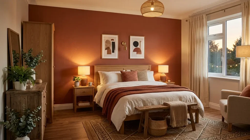
1. Burnt Orange Feature Wall Behind the Bed as the Room’s Anchor
✦ Best for: a bedroom where a single wall in a warm accent color creates a dramatic focal point without overwhelming the entire space
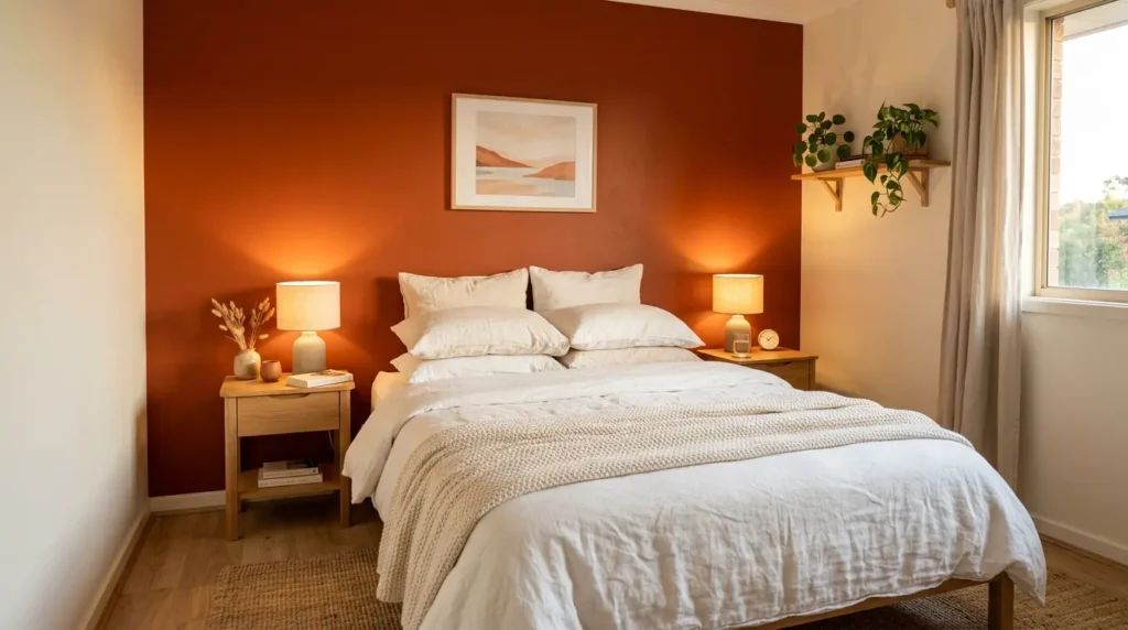
A single burnt orange feature wall behind the bed is the most common and most successful application of this color in a bedroom — it provides all the warmth, drama, and personality of the color on the wall where it creates the most visual impact while keeping the other three walls neutral enough to prevent the room from feeling enclosed or dominated by a single color. The bed positioned against the burnt orange wall creates the specific framing effect where the bed appears set into a warm backdrop rather than floating against a neutral surface.
The colors for the remaining three walls that work best with a burnt orange feature wall: warm white is the most versatile and creates the strongest contrast that makes the burnt orange read at its most beautiful. Warm greige or stone creates a softer transition between the accent wall and the rest of the room and suits a bedroom where the full contrast of white against burnt orange feels too stark. A very pale version of the burnt orange — diluted significantly to create an almost neutral blush — creates a tone-on-tone effect that is sophisticated and contemporary.
The bedding that works best against a burnt orange feature wall: white or warm white linen creates the maximum contrast and the most hotel-quality presentation. Natural cream or oatmeal linen creates warmth without the starkness of pure white against the orange. Avoid bedding in a color that competes with the orange — deep burgundy, warm red, or terracotta bedding against a burnt orange wall reduces the impact of both because neither reads as a deliberate design choice against the other.
2. Burnt Orange Bedding and Textiles as a Warmer Alternative to White
✦ Best for: a bedroom with neutral walls where a burst of warm color in the bedding creates seasonal warmth without any painting
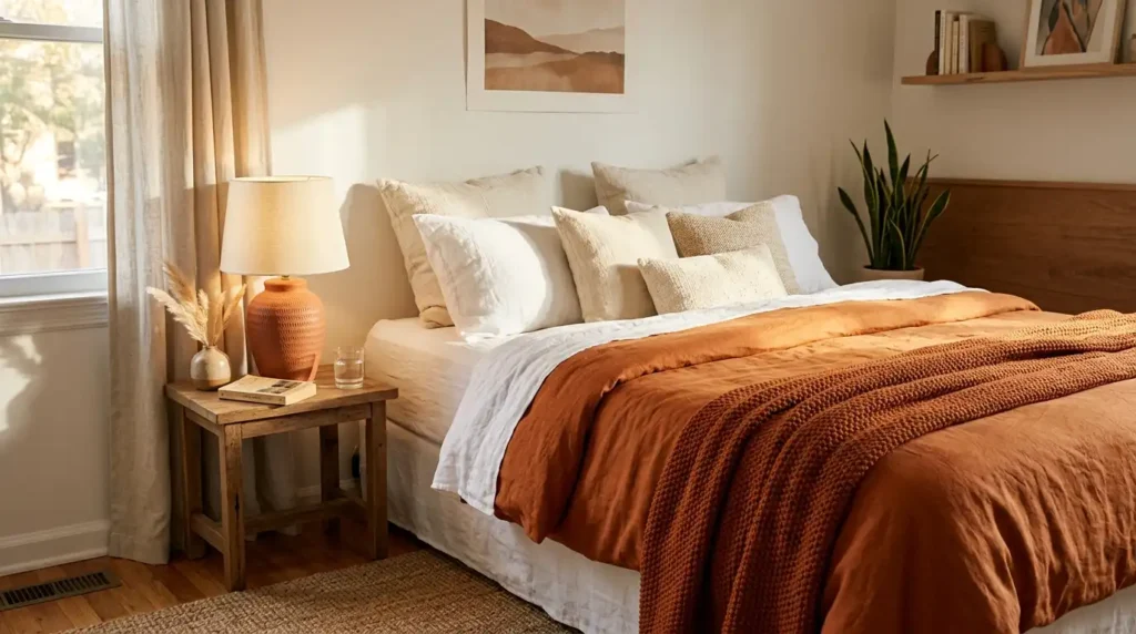
Introducing burnt orange through bedding rather than paint is the approach that offers the most flexibility — the color can be dialed up or down seasonally by swapping duvet covers, and the commitment is entirely reversible without any repainting. A burnt orange duvet cover in a washed linen or soft cotton against white walls and white pillowcases creates a warm, inviting bed that reads as genuinely designed rather than a default neutral bedroom.
The textile layering approach that keeps burnt orange bedding from reading as a single strong statement: layer the burnt orange duvet cover with white or cream linen pillowcases rather than matching burnt orange cases — the contrast between the orange and the white creates a more sophisticated presentation than a fully matched set. Add a natural or cream woven throw at the foot of the bed that introduces a different texture while remaining tonally calm enough to ground the orange rather than competing with it.
The Blissy Silk Pillowcase in champagne or ivory alongside a burnt orange linen duvet cover creates a premium sleeping surface combination — the silk’s natural sheen against the matte texture of linen creates material contrast that photographs beautifully and feels genuinely luxurious. Find it linked on Amazon. The combination of warm ivory silk and earthy burnt orange is one of the most naturally beautiful bedroom textile pairings available.
3. The Best Color Combinations for a Burnt Orange Bedroom
✦ Best for: choosing the surrounding palette that makes burnt orange look genuinely beautiful rather than isolated or clashing

Burnt orange works best in a bedroom when surrounded by colors that either contrast it strongly enough to give it clarity or complement it closely enough to create warmth without competition. The color combinations that consistently produce the most beautiful burnt orange bedroom results:
Burnt orange and deep forest green:
One of the most striking color combinations available in interior design. The contrast between warm orange and cool green creates a vibrant but grounded pairing that references autumn foliage without looking seasonal. Forest green in a plant, a cushion, or a single accent piece against a burnt orange feature wall or bedding creates immediate visual interest.
Burnt orange and warm white:
The most versatile combination that suits any bedroom style. Warm white provides the maximum contrast that makes burnt orange read at full impact while keeping the overall room light and fresh. The warmth of the white tone prevents the contrast from feeling harsh.
Burnt orange and natural timber:
Warm timber in any furniture — bedside tables, a bed frame, a floating shelf — pairs naturally with burnt orange because both colors share warm undertones that create a cohesive palette rather than a contrast. Warm oak and burnt orange together create the specific quality of a well-traveled, organically assembled bedroom that feels genuinely considered.
Colors to avoid with burnt orange in a bedroom: cool grays and cool blues that clash with the warm undertones of orange rather than complementing them. Bright yellow which reads as competing with orange rather than working alongside it. Pure black which creates a contrast so strong it removes the warmth that is the entire appeal of burnt orange as a bedroom color.
4. Burnt Orange Accessories That Add Color Without Commitment
✦ Best for: testing the burnt orange palette in a bedroom before making any permanent changes
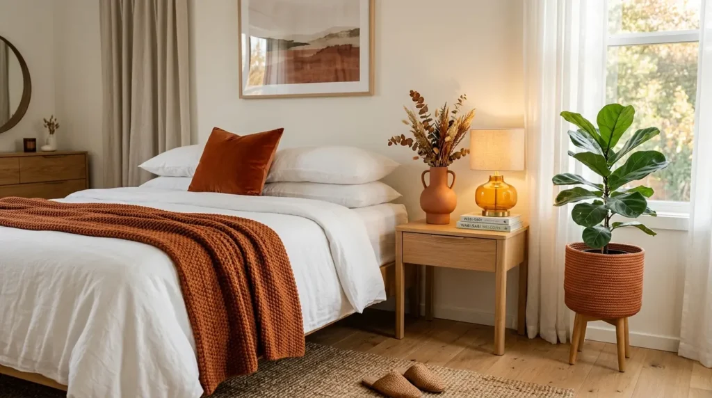
Starting with burnt orange accessories rather than paint or bedding is the lowest-commitment and most reversible way to introduce the color into a bedroom — and often the version that ends up being the most sophisticated, because a bedroom where burnt orange appears in two or three carefully chosen accessories reads as more deliberately designed than one where the color is applied to a full wall or an entire bedding set.
The accessories that introduce burnt orange most effectively in a bedroom: a single terracotta or burnt orange ceramic vase on the nightstand or dresser — ceramic in this color is one of the most natural-looking and most beautiful forms the color takes. One burnt orange or terracotta cushion on the bed as an accent against neutral bedding. A terracotta plant pot for the bedroom plant. A warm amber glass lamp base that reads as a softer version of the same warm orange tonal family.
The accessory rule that keeps burnt orange from reading as a collection of isolated objects rather than a considered palette: group the burnt orange accessories so they read as part of the same visual story. A terracotta vase and a terracotta plant pot on the same dresser surface create a deliberate collection. The same objects scattered to opposite corners of the room create two unrelated objects that happen to share a color.
5. A Boho Burnt Orange Bedroom for Maximum Warmth and Personality
✦ Best for: a bedroom where the boho aesthetic provides the natural context for burnt orange as part of a warm earth tone palette
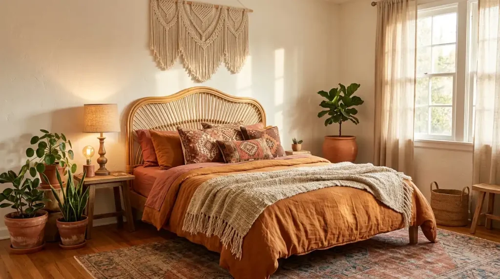
Burnt orange is one of the core colors of the boho bedroom aesthetic because it belongs naturally to the warm earth tone palette — terracotta, ochre, burnt orange, warm cream, and natural timber — that the boho aesthetic is built around. In a boho bedroom context burnt orange never reads as a single dominant color because it is one of several warm tones all sharing the same temperature and all working together as a family rather than competing as individual statements.
The boho burnt orange bedroom elements that create the most authentic result: a rattan headboard that introduces natural organic material as the bed’s primary frame. Layered textiles with burnt orange as the primary tone — a woven throw in orange and cream, a printed cushion in a geometric pattern that includes orange alongside ochre and natural. Terracotta plant pots for every plant in the room. A macrame wall hanging in natural cotton above or beside the bed.
The specific quality that makes boho burnt orange bedrooms look genuinely beautiful rather than simply colorful: the muting of every tone in the palette. Burnt orange in its muted, clay-influenced version. Ochre in its dusty rather than bright form. Cream and natural rather than stark white. Every color in the boho burnt orange palette should feel like it has been slightly sun-faded — this specific quality is what distinguishes a sophisticated boho palette from a bright and childlike one.
6. Burnt Orange in a Dark and Moody Bedroom for Maximum Drama
✦ Best for: a bedroom where a dark background makes burnt orange glow rather than simply appearing as a warm accent on a light wall
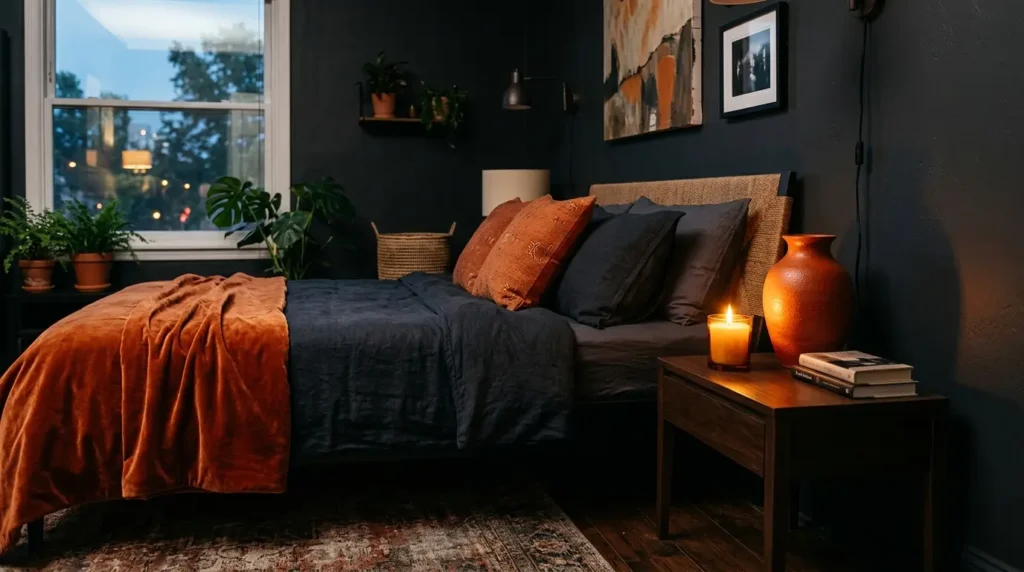
Burnt orange against a dark background — charcoal, deep forest green, or midnight navy — creates a completely different and considerably more dramatic visual effect than the same color against white. The dark background makes burnt orange glow with warmth in a way that light walls cannot — the contrast between the deep dark of the wall and the warm vibrancy of the orange creates the specific quality of firelight or ember glow that is the most dramatic version of this color available in a bedroom.
The dark and moody burnt orange bedroom works best with the color appearing in textiles and accessories rather than on a wall — a burnt orange throw against charcoal bedding, a terracotta vase on a dark nightstand, warm amber candlelight. In this context the burnt orange does not need to be the dominant color to create enormous visual impact — even small doses glow dramatically against a dark background.
The dark bedroom wall color that pairs most beautifully with burnt orange accents: deep forest green creates the most naturally balanced pairing because green and orange are complementary colors that enhance each other’s intensity when placed together. Deep charcoal reads as the most sophisticated pairing because it is entirely neutral and allows the burnt orange to provide all the warmth in the room without any competition from the wall color.
7. Small Burnt Orange Bedroom Ideas That Work in Compact Spaces
✦ Best for: a small bedroom where a full burnt orange feature wall might feel too intense and a more restrained approach is needed
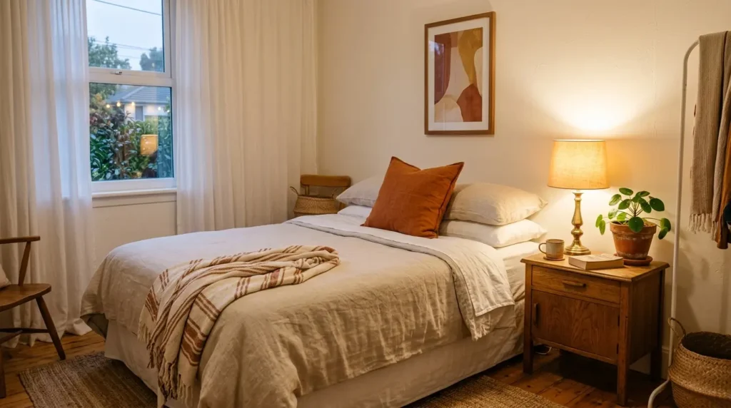
A small bedroom benefits from restraint with burnt orange rather than full commitment — the color has enough visual weight that even a modest amount creates significant warmth in a compact space. In a small bedroom the accessories and textile approach is almost always more successful than a feature wall, because the feature wall in a small room occupies proportionally more of the visual field than in a larger room and can tip the balance from warm to enclosed.
The specific burnt orange applications that work best in a small bedroom: one burnt orange or terracotta cushion on the bed as the single strongest color element in the room. The bedroom plant in a terracotta pot rather than a white or neutral pot — the terracotta introduces the same warm orange family in a natural and organic form that reads as incidental rather than deliberately color-coordinated. Warm amber lamplight from a glass or ceramic lamp base on the nightstand that introduces orange-adjacent warmth through light rather than through color.
The wall approach that works in a small bedroom when some burnt orange on the wall is wanted: paint only the wall behind the bed rather than all four walls, and choose a version of the color that is significantly muted — closer to warm terracotta than vivid burnt orange. A muted terracotta on the headboard wall of a small bedroom adds warmth without the intensity of a full-strength burnt orange that would make the compact room feel enclosed.
📌 More bedroom decor ideas: Boho Bedroom Ideas You’ll Want to Copy
Frequently Asked Questions
Is burnt orange a good color for a bedroom?
Burnt orange is an excellent bedroom color when used in its muted, earthy form rather than as a bright or vivid orange. The muted, clay-influenced version of burnt orange creates genuine warmth and depth that makes a bedroom feel cozy and considered without the harshness of a bright orange. It works best as a feature wall color, in bedding and textiles, or through terracotta accessories and plant pots. According to the Color Marketing Group, warm earthy oranges including burnt orange, terracotta, and rust have been consistently identified as among the most popular and most emotionally positive color choices for residential interiors, associated with warmth, comfort, and creative energy.
What colors go with burnt orange in a bedroom?
The colors that work best with burnt orange in a bedroom: warm white for the strongest and most versatile contrast. Natural cream and oatmeal for a softer, warmer version of the same contrast. Deep forest green for the most dramatically beautiful complementary pairing. Natural timber tones for organic warmth that shares the same temperature as burnt orange. Ochre and dusty yellow for a tonal earth palette where all colors share warm undertones. Colors to avoid: cool grays, cool blues, and pure black all clash with the warm undertones of burnt orange and reduce its warmth rather than enhancing it.
How do I use burnt orange without it being overwhelming?
Burnt orange becomes overwhelming in a bedroom when it is applied to all four walls or when the shade used is too vivid and bright rather than muted and earthy. The approaches that keep burnt orange from overwhelming a bedroom: use it on one wall only as a feature behind the bed. Choose a muted, clay-influenced shade rather than a bright vivid orange. Surround it with warm whites and natural materials that absorb its warmth rather than reflecting it back. Introduce it primarily through textiles and accessories in a small room where a wall application might feel too intense.
What style of bedroom suits burnt orange?
Burnt orange suits several bedroom styles depending on how it is applied: the boho bedroom style suits it most naturally because burnt orange is a core color of the warm earth tone boho palette and appears alongside natural materials like rattan, jute, and terracotta that enhance its organic quality. The maximalist bedroom suits it as one of several warm jewel tones. The dark and moody bedroom suits it as a glowing accent against a deep background color. Contemporary and transitional bedroom styles suit it as a single feature wall or in bedding with otherwise neutral surroundings. The one style it suits least is the cool minimalist aesthetic where warm orange creates a temperature mismatch with the cool grays and blues that define that palette.
More Bedroom Decor Ideas
→ Master Bedroom Ideas That Make You Never Want to Leave
→ Witchy Bedroom Decor Ideas That Create Instant Moonlit Vibes
→ Bedroom Wall Decor Stickers That Make Small Rooms Feel Bigger
Start with one terracotta cushion and one terracotta plant pot. If the color feels right in those two objects the feature wall will feel right too.