The difference between a family photo wall that looks designed and one that looks cluttered almost always comes down to a handful of decisions made before a single nail goes into the wall. Family photo wall ideas that actually work are not about which photos to use or how many to hang — they are about frame consistency, spacing discipline, and the specific layout approach that creates visual order even across a wall covered in different photographs.
This guide covers the complete process for creating a family photo wall that looks genuinely considered — from choosing and preparing the frames through laying out the arrangement on the floor, transferring it to the wall with precision, and the finishing details that separate a photo wall that looks like a professional installation from one that looks like it was hung one piece at a time over several years.
Table of Contents
Why Most Photo Walls Look Cluttered and How to Avoid It
Most family photo walls accumulate rather than get designed. One frame goes up, then another nearby, then a third to fill a gap, and after several years the wall holds twelve different frame styles, three different wood tones, four different mat colors, and spacing that ranges from two inches to eight inches between pieces depending on where each one was added relative to what was already there. The result looks collected rather than curated — charming in a very informal way but not something that improves the room.
The three specific decisions that cause most photo walls to look tacky rather than designed: mixed frame materials and finishes across the same wall, inconsistent spacing between frames that varies without any deliberate logic, and a lack of a clear outer boundary to the arrangement so it trails off at the edges without a defined edge. Each of these is entirely avoidable with a minimal amount of planning before the first nail goes in.
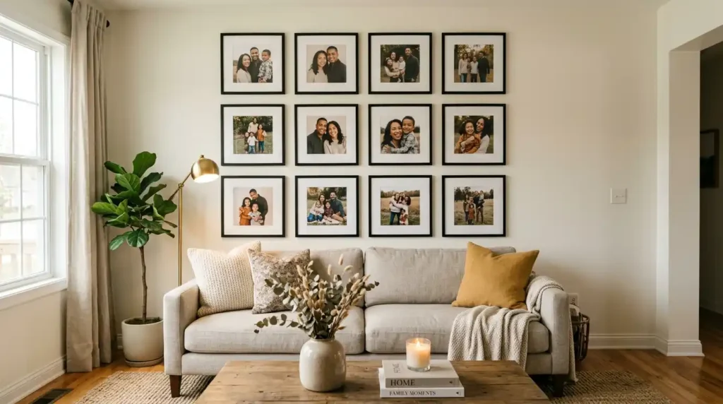
The decision that has the single largest impact on whether a photo wall looks designed or assembled: frame consistency. A wall of twelve photographs in twelve different frames will always look more cluttered than the same twelve photographs in twelve matching frames, regardless of how well the individual photos are chosen or arranged. Frame consistency is the design decision that does the most visual work on a photo wall, and it costs nothing to implement if addressed before the frames are purchased.
Choosing Frames That Work Together on the Wall
The most consistently successful approach to photo wall frames is to use a single finish across all frames while varying the size — typically two or three different sizes from the same frame line or with matching profiles. Black, white, and natural light wood are the three finishes that work in the widest range of interior styles and wall colors.
Black frames:
The most graphic and most contemporary frame choice. Black frames with white mats create the strongest visual definition between photograph and wall, making each image read as a distinct piece rather than blending into the arrangement. This combination works on walls of any color and suits contemporary, transitional, and modern farmhouse interiors equally well.
White frames:
Softer than black and better suited to lighter, more Scandinavian-influenced interiors. White frames on a white wall create a tone-on-tone effect where the frame profile barely registers and the photographs float on the wall surface — a clean, modern approach that works particularly well with black-and-white photography or film photographs with muted tones.
Natural light wood frames:
Warm and organic, best suited to neutral or warm-toned interiors. Natural wood frames suit color photography particularly well because the warm frame tone complements the warm tones typical of family photographs. The key is using a consistent wood tone and profile across all frames rather than mixing different wood species and finishes, which immediately creates the mixed-material look that reads as accumulated rather than designed.
Why Consistent Photo Editing Matters as Much as Frame Choice
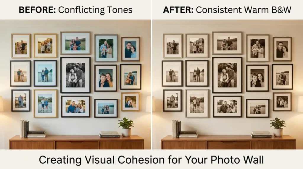
This is the photo wall decision that most people never consider and that makes an enormous difference to the finished result: the photographs themselves need to have a consistent visual treatment to work together on a wall, just as the frames do. A wall of twelve photographs taken across different years, different devices, different lighting conditions, and with wildly different color tones will look incoherent even in matching frames.
Converting all photographs to black and white is the most reliable way to create immediate visual consistency across a collection of images taken at different times under different conditions. Black and white removes the color cast variations between old and new photographs, equalizes the visual weight of all images regardless of their original color palette, and creates the specific timeless quality that makes family photo walls look like a curated collection rather than a random selection.
If color photographs are preferred, apply a consistent Lightroom preset or Instagram-style filter to all images before printing — the same warmth adjustment, the same contrast level, the same slight fade to the shadows. The visual consistency this creates across different original photographs is immediately apparent on the wall compared to unedited photographs printed as-is.
Planning the Layout Before Touching the Wall
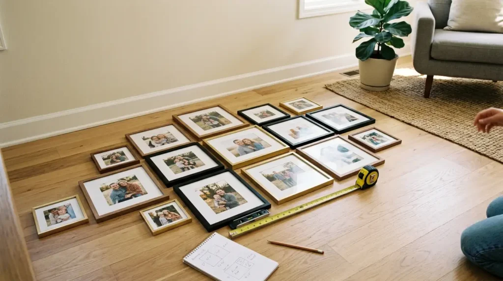
Every well-executed photo wall was planned on the floor before it went on the wall. Lay all frames face-down on the floor in the space in front of the intended wall, and arrange them in the intended composition while you can still move them freely without making any holes. This step transforms what would be a trial-and-error wall process into a single decisive installation.
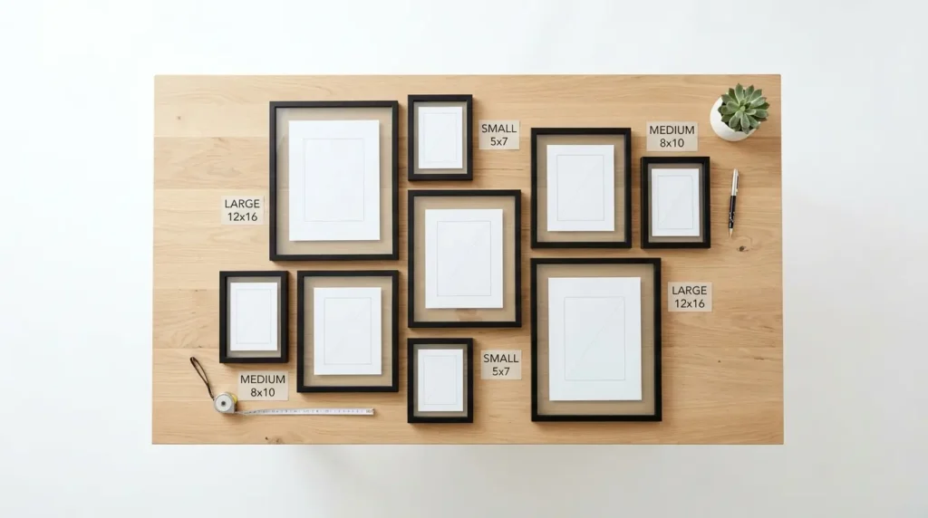
Two layout approaches consistently produce the cleanest results on the wall: a strict grid of equal-sized frames in perfectly regular rows and columns, or a salon-style arrangement of mixed sizes organized around a central anchor piece. The grid is more contemporary and more precise. The salon style is more relaxed and more forgiving of imperfect spacing, which makes it better suited to a first photo wall installation.
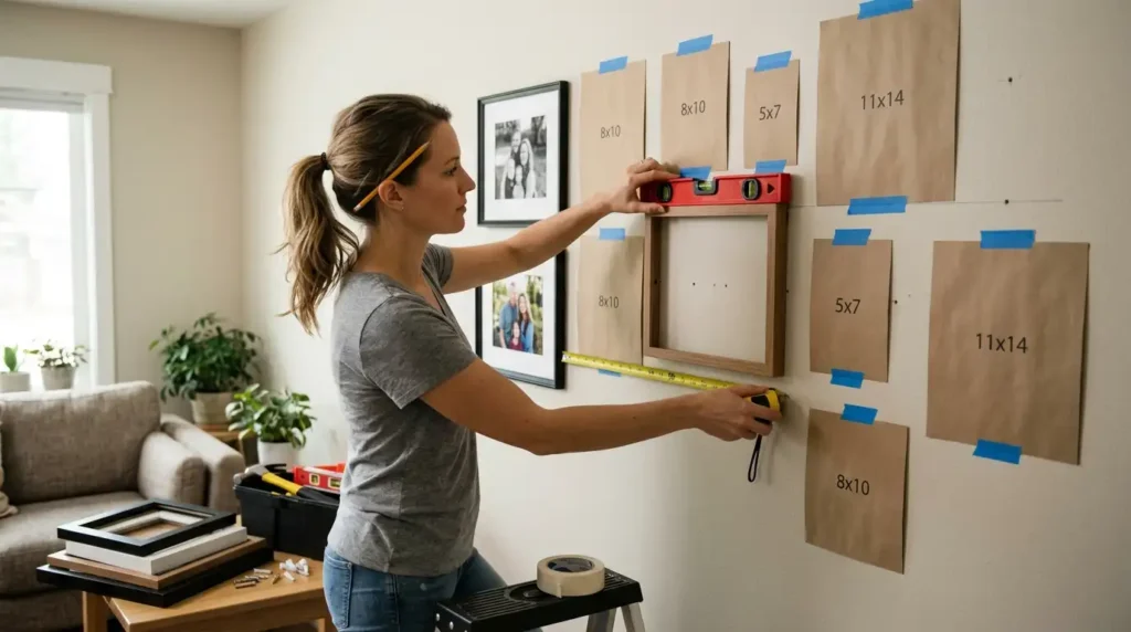
Once the floor arrangement is finalized, trace each frame onto paper, cut out the tracings, and tape them to the wall in the intended positions using painter’s tape. This paper template process allows the exact arrangement to be previewed at full scale on the actual wall, adjusted if needed, and confirmed before any permanent holes are made. Mark the hanging hardware position on each paper template before removing them and driving the nails.
The time invested in the paper template step is repaid immediately in the installation — a photo wall installed this way is done correctly in a single session rather than requiring multiple repositioning attempts, extra nail holes, and gradual correction over several attempts.
The Golden Rules of Equal Spacing and Intentional Frame Scaling
Spacing between frames is the single most technically precise aspect of photo wall installation, and inconsistent spacing is the most immediately obvious sign that a photo wall was hung without a plan. The brain detects spacing inconsistency almost instantly — two gaps that look similar but differ by a half inch register as wrong even when the viewer cannot identify exactly why the arrangement looks off.
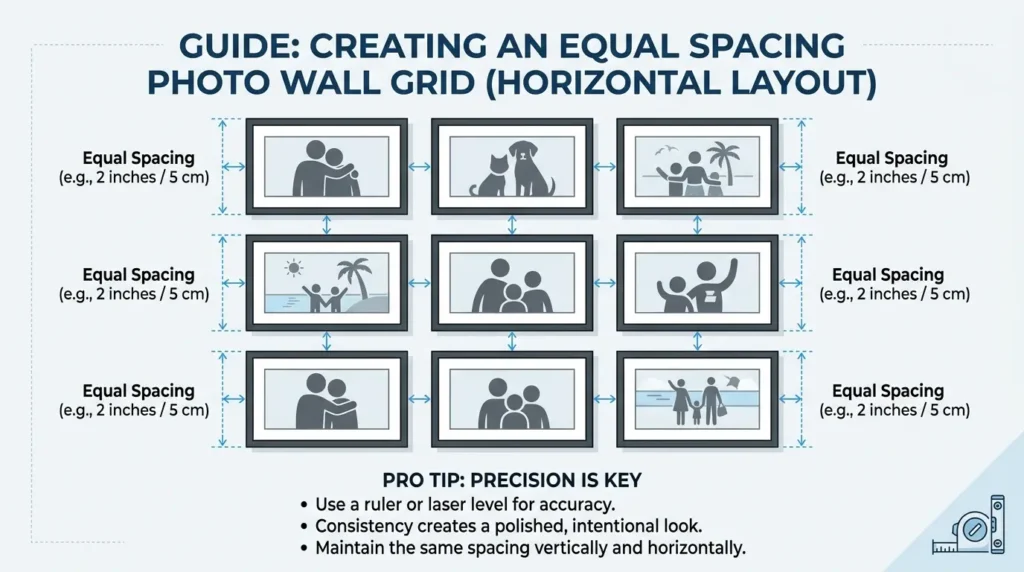
The two-inch rule for grid arrangements:
For a strict grid arrangement of matching frames, two inches of consistent spacing between each frame in both directions is the standard that produces the cleanest result. Two inches reads as deliberate rather than accidentally close, and the regularity of the spacing across the entire arrangement creates the graphic precision that makes a grid photo wall look genuinely professional. Measure every gap with a tape measure or a two-inch spacing guide cut from cardboard rather than estimating by eye.
The salon-style anchor and scale principle:
For a salon-style mixed arrangement, start with the largest frame as a center anchor and build outward symmetrically. The largest frame should be the most meaningful photograph — a wedding photo, a family portrait, a milestone — rather than the most visually interesting one, since it will draw the most attention from the arrangement. Maintain consistent spacing throughout even in the mixed arrangement — the variation is in size, not in spacing regularity.
The total arrangement boundary:
Define the outer boundary of the photo wall before placing any frames. Above a sofa, the arrangement should not extend wider than the sofa below it and should leave at least six to eight inches between the bottom of the lowest frame and the sofa back. The top of the arrangement should reach to between two-thirds and three-quarters of the wall height — high enough to fill the wall presence above the sofa without reaching uncomfortably close to the ceiling.
Installing the Photo Wall Without Extra Holes
Work from the center out rather than from one edge across. Install the center anchor frame first, confirm it is level with a spirit level, and build outward in both directions from that fixed reference point. This approach ensures that any minor measurement error accumulates toward the edges of the arrangement rather than compounding across the center where it is most visible.
Check level on every single frame as it goes up — not every other frame, not approximately level by eye, every frame individually. A frame that is even two degrees off horizontal is immediately visible to any observer standing at normal viewing distance, and the error becomes more jarring when it sits alongside frames that are correctly level.
Adhesive hanging strips such as Command Strips are an acceptable alternative to nails for lighter frames on plaster walls, with the significant advantage that they leave no wall damage when removed. For heavier frames, nails into wall studs or appropriate wall anchors are required. Mark stud positions with a stud finder before beginning installation and plan the layout so at least the larger, heavier frames hang from stud-anchored hardware.
📌 More home decor ideas: Minimalist Men’s Bedroom Ideas for a No-Fuss Dad
Frequently Asked Questions
How do you arrange a family photo wall?
Arrange a family photo wall by laying all frames on the floor in the intended composition before touching the wall, choosing between a strict grid layout for a contemporary result or a salon-style mixed arrangement for a more relaxed effect, tracing the frames onto paper templates and taping them to the wall for a full-scale preview, then installing from the center anchor piece outward. According to the National Gallery of Art, gallery installations consistently begin with a central anchor composition that is built outward in both directions, because this approach maintains visual balance across the full arrangement more reliably than starting from one edge.
What size frames should be used for a photo wall?
For a grid photo wall, a single frame size — typically 5×7 or 8×10 — used consistently across the entire arrangement produces the cleanest result. For a salon-style arrangement, a mix of three sizes works well: a large anchor frame at 16×20 or 18×24, medium supporting frames at 8×10 or 11×14, and smaller accent frames at 4×6 or 5×7. The exact sizes matter less than the consistency of the frame profile and finish across all sizes.
How high should a photo wall be above a sofa?
The bottom of the lowest frame in a photo wall above a sofa should sit six to eight inches above the sofa back — close enough to read as intentionally related to the furniture below without creating the visual gap that makes the arrangement look like it was placed randomly. The visual center of the entire arrangement should sit at approximately seated eye level, roughly 57 to 60 inches from the floor, which is the standard gallery hanging height used by professional art installers.
Should all photos on a wall be black and white?
Converting all photographs to black and white is the most reliable method for creating visual consistency across family photographs taken at different times and in different conditions, but it is not the only option. A consistent warm color treatment applied uniformly across all photographs achieves the same cohesion while preserving color. What consistently fails is a mix of high-color photographs, desaturated photographs, and black-and-white photographs on the same wall — the tonal inconsistency between them creates visual discord that no amount of frame consistency or careful spacing can fully overcome.
More Home Decor Ideas
→ 7 Home Office Decor Ideas That Make Dad Feel Like a King
→ Leather Furniture Modern Room Styling Tips for Dad
→ Reading Nook Ideas Around Dad’s Favorite Chair
Plan it on the floor first. The wall only needs to happen once.